
Pattern Mixing in Everyday Outfits: The Unwritten Rules

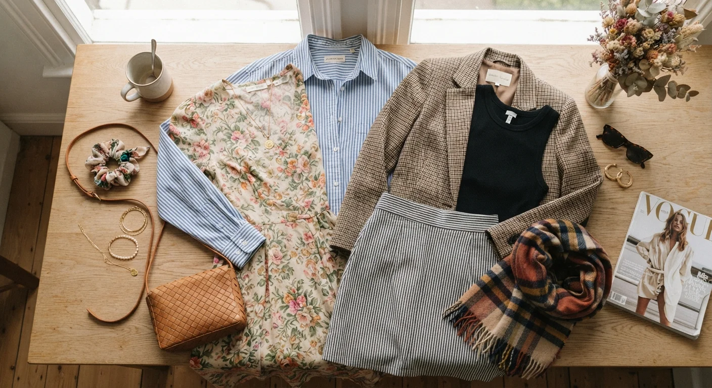
Photo: InDepthReads.com | Streamlining Learning For All editorial
Key Takeaways
- Vary pattern scales so prints don't compete — pair a large print with a smaller one.
- A shared color between patterns is the easiest way to make a combination feel intentional.
- Anchoring a mixed-pattern outfit with a solid neutral keeps the look grounded and wearable.
- Not every piece needs to be the star — let one print lead and the other play a supporting role.
- Confidence in wearing pattern combinations often matters more than following a strict formula.
Why Pattern Mixing Feels Hard (But Isn't)
Most people avoid mixing prints not because they don't like the look, but because they're not sure what separates a polished combination from a chaotic one. The truth is, there's no single rulebook — but there is a loose logic that experienced dressers follow intuitively, and once you see it, pattern mixing stops feeling like a gamble.
The key insight is that patterns interact through scale, color, and visual weight. When those three elements are thoughtfully balanced, mismatched prints can look surprisingly harmonious. When they clash, it's usually because two or more of those variables are competing at the same intensity. Understanding that framework turns pattern mixing from a guessing game into a skill.
If your outfits sometimes feel like they're missing something, it's worth exploring what makes an outfit feel pulled together — the same principles often apply here.
The Practices That Make It Work
These aren't rigid rules — think of them as tested guidelines that give you a starting point. From there, your own eye takes over.
Vary pattern scale — always pair a large print with a smaller one.
Use a shared color as your connecting thread.
Let one pattern do the talking and one play a supporting role.
Anchor the look with at least one solid neutral piece.
Mix patterns from different categories for more visual interest.
Quick Wins to Try Today
You don't need a wardrobe overhaul to start experimenting. These small moves can get you comfortable with the concept fast.
For a deeper look at how neutrals can anchor bolder choices, see our guide on making the most of neutral colors in everyday outfits.
Common Pitfalls and How to Sidestep Them
Even with the best intentions, a few missteps tend to come up repeatedly. The most common one: mixing two bold, large-scale prints of similar visual weight. Each print fights for attention and neither wins. The fix is usually as simple as swapping one for a smaller, quieter version of a similar motif.
Another pitfall is ignoring color temperature. Warm-toned patterns (think rust, mustard, olive) and cool-toned ones (cobalt, lavender, slate) can feel discordant when placed together without a bridging neutral. A white shirt, cream trousers, or a camel coat can smooth that transition.
Pattern Mixing Is Personal — Not Prescriptive
It's also worth remembering that pattern mixing is just one tool in the styling toolkit. If you're weighing how much visual interest to build into an outfit overall, our piece on balancing statement pieces with wardrobe basics is a useful companion read.
The content on this site is for informational purposes only and is not a substitute for professional advice. Always consult a qualified professional for guidance specific to your situation.